For traders, charts are one of the most valuable tools for analyzing stocks and making profitable trading decisions. Charts provide a visual representation of a stock's price movement over time. At a glance, charts allow traders to identify important patterns, trends, support/resistance levels, and potential entry and exit points.
Knowing how to read stock charts is an essential skill for stock traders. There are several major types of charts, including line charts, bar charts, candlestick charts, and point and figure charts. Each type provides unique information and perspectives on the trading behavior of a stock.
Traders use charts on different timeframes to gain insight into both the short-term and long-term outlook. By combining chart analysis with other research, such as fundamentals and news events, traders can confirm high probability trades.
Mastering charting skills and integrating charts into a disciplined trading strategy is essential for traders seeking consistency and profitability. The visual nature of charts allows traders to identify opportunities and make informed trading decisions quickly.
Types of Charts
Line charts - simple plot of closing price over time
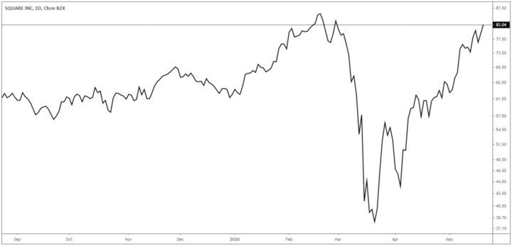
Line charts are one of the most basic types of charts used by traders. As the name suggests, line charts simply plot the closing prices of a stock over a period of time, with the closing prices connected by a line. The line illustrates the overall movement and direction of the stock's price.
For example, if a stock's closing prices over 20 days were plotted on a line chart, you would see the line connecting these prices, indicating whether the trend is up, down, or sideways. The line smooths out intraday price fluctuations and allows traders to easily identify the prevailing trend.
Line charts do not provide information about intraday highs and lows. The simple visual nature of line charts makes them easy to read quickly, which is beneficial for traders who want to understand the core trend of the stock. However, line charts lack some of the detail that other chart types can provide.
Traders generally use line charts to get the "big picture" of a stock's price trend over weeks or months, while using other chart types, such as candlestick charts, to determine specific trade entry and exit points over a shorter time frame.
Source: tradingview
Typical uses of the line chart
Line charts are often used by investors who simply need a straightforward view of a stock's trading history over time, without all the details of intraday price movements. The simple line connecting closing prices allows investors to gauge the overall trend.
Line charts are also useful for traders who want to filter out some of the noise or volatility seen on candlestick charts. Looking at the closing prices plotted on a line can help smooth out intraday price fluctuations and make the prevailing trend more visible over a longer period of time.
In summary, line charts serve two main purposes - they provide investors with a basic overview of the stock's price history and allow traders to simplify candlestick charts to better identify the core trend. The streamlined nature of line charts makes them a valuable starting point for analysis.
Bar charts - open, high, low, close for each period
Bar charts are a popular chart type used by active traders to analyze stocks. Unlike line charts, which show only closing prices, bar charts show the open, high, low, and close for each trading period. Typically, the trading periods shown are days, so each bar represents one day's trading range.
Source: tradingview
For example, a daily bar chart would show one vertical bar for each trading day. The opening price is plotted on the left side of the bar, and the closing price is plotted on the right side. The high and low prices for that day determine the top and bottom of the vertical bar.
This means that bar charts give traders more insight into the price action and volatility for each daily period. The size of the bar's range indicates the stock's volatility that day, while the direction of the bar shows the price movement between the open and close.
Large bars indicate high volatility that day, while small bars indicate consolidation. Up bars indicate that the close was higher than the open. Down bars indicate that the close was lower than the open.
By studying sequences of bars, traders can identify patterns and trends in a stock's price behavior. Bar charts provide much more texture than line charts.
Active traders use bar charts on daily, hourly, or even minutely timeframes to make informed decisions about entering, exiting and managing risk. The additional open, high, low and close data gives them an edge.
Point and figure charts - charts only price movements, ignores time
Point and figure charts are a type of financial chart that shows price action without considering the passage of time. They focus solely on price movements and ignore time and volume.
Point and figure charts use a column of X's to record upward price movements, while a column of O's tracks downward movements. A new X or O is added to a column only when a price movement exceeds a box size set by the trader. This filters out small price movements.
When the price reverses by the box size, a new column is started next to the existing column. Gaps are left on the chart when the price moves significantly in one direction. The perceived noise of other chart types is removed.
Source: investopedia.com
Key details displayed by point and figure charts include
- Price Targets - Significant support and resistance levels are clearer. Price targets can be projected.
- Trend identification - Changes in supply and demand are visible. Trend reversals and continuations are highlighted.
- Pattern recognition - Simple yet valid chart patterns emerge, such as double tops, triangles, flags.
The main advantage of point and figure charts is that they filter out minor price movements to focus on the underlying trend. Their simplicity and objectivity appeal to many traders.
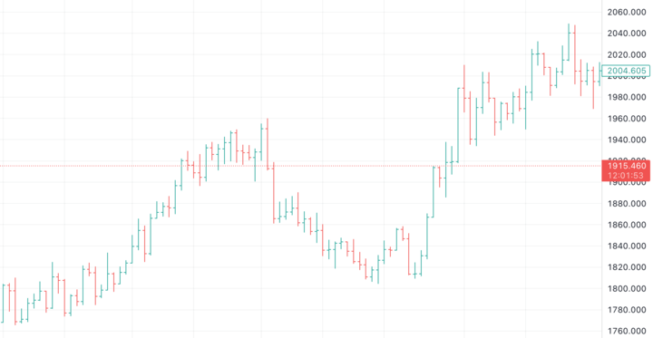
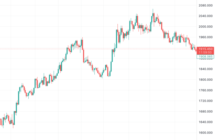
Candlestick charts - bar chart with colored/filled candle bodies [most popular]
Candlestick charts build on bar charts by adding a box or filled body to each bar. This creates a candlestick shape and provides even more information than a regular bar chart.
The body of the candlestick represents the range between the open and close for that time period. If the close is higher than the open, the body is hollow or unfilled and is usually displayed as white or green. This is a bullish candlestick.
If the close is lower than the open, the body is filled and is usually black or red. This is a bearish down bar.
The thin lines above and below the body represent the high and low. Thus, candlestick charts retain the open, high, low, and close data of bar charts, but emphasize the relationship between the open and closed by coloring the candlesticks.
For example, a long green candlestick indicates strong buying pressure during that period, with the close well above the open. A small red candlestick signals that the close was slightly below the open, indicating selling pressure. Traders can gauge buying and selling momentum based on candlestick size and color.
Candlestick charts allow traders to identify patterns and trends more easily than staring at uncolored bars. Reversal and continuation patterns emerge from candlestick analysis. Common patterns include doji, hammer, shooting star, and engulfing patterns. Candlestick charts are preferred by active traders for entry and exit signals. They provide more clarity about price action than bar charts.
Source: tradingview
Why traders need charts
Charts are the most important tool for traders because they allow them to identify opportunities and manage risk. Successful trading is not about the charts themselves, but rather about a trader's ability to anticipate price trends and control risk. Charts make both of these skills possible.
All profitable traders take advantage of the predictable psychology that drives market participants. Skilled traders are experts in behavioral finance - understanding the irrational behaviors of fear, greed, and herding inherent in the market. Stock charts show this market psychology at work in real time.
By analyzing charts, traders can identify patterns that tend to repeat themselves because humans react with emotion rather than logic. This pattern recognition gives them an edge in predicting future price movements.
In addition, charts are essential for effective risk management. Prudent traders do not use static stop losses. They dynamically set stop levels based on support, resistance and volatility shown on the charts. This flexibility prevents them from getting stopped out prematurely.
The key levels and price action shown on the charts guide a trader's entry and exit decisions. Without this market insight, they are trading blindly. Charts reveal the irrationality of the market. They transform trading from gambling into a calculated strategy based on high probability price action. Charts are the window to the psychology that drives the market.
Key Components of Stock Charts
Price scales - linear vs logarithmic
Stock charts display the price on the vertical axis. Prices can be displayed on either a linear or logarithmic scale.
A linear scale shows absolute price changes. For example, a move from $10 to $20 is shown as the same size move as a move from $20 to $30.
A logarithmic scale shows percentage price changes. A logarithmic scale better shows true trends because stocks tend to move in percentages, not absolute dollars.
For example, a move from $10 to $20 is a 100% gain, while a move from $20 to $30 is only a 50% gain. On a logarithmic scale, the move from $10 to $20 is twice as large as the move from $20 to $30 to accurately reflect the relative gains.
Logarithmic scales also prevent extreme price movements from distorting the chart. For example, a move from $100 to $200 would dwarf smaller moves on a linear scale. But on a log scale, it is simply a 100% gain, just like any other doubling in price.
Traders typically use log scales for long-term charts to identify overall trends. Linear scales are better for short-term charts to time entries and exits. The key is to choose the scale that provides maximum clarity of price action.
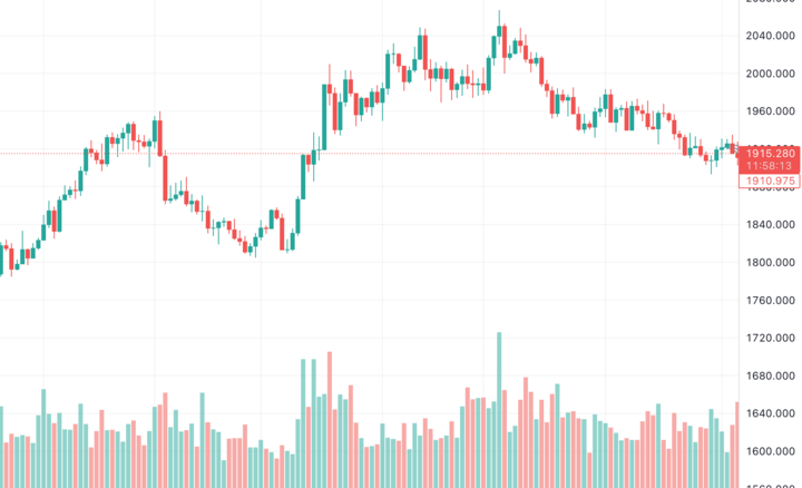
Volume - trading volume as indicator along bottom
In addition to showing the price, stock charts also show trading volume, usually as a separate panel at the bottom of the chart.
Volume shows the number of shares or contracts traded during each time period. Monitoring volume provides important clues about the strength and conviction behind price movements.
Rising prices with increasing volume indicate strong upward momentum. High volume confirms that more market participants are actively buying shares, adding strength to the uptrend.
Conversely, falling prices with increasing volume warn of a potential downward acceleration. High volume signals that more traders are urgently selling shares, adding to the selling pressure.
Low volume during price movements indicates a lack of commitment behind the trend. When prices rise on light volume, it indicates a reluctance to buy at higher levels. The trend is vulnerable to being broken.
Studying volume surges or spikes can identify turning points. High volume breakouts indicate new trends, while extreme volume on pullbacks indicates likely support or resistance. Volume analysis provides an important perspective on price action.
Traders can also analyze volume using indicators such as on-balance volume or volume-weighted moving averages. But the raw volume data itself is most important for assessing the conviction behind trends. Volume provides clues that price action alone does not.
Examples of using volume analysis on stock charts:
- Prices are rising but volume is falling - indicating that upward momentum is weakening. A lack of buying interest indicates that the uptrend may be nearing exhaustion. Traders may want to take profits soon.
- Price tops out and begins to fall on a surge of volume - The high volume on the price reversal signals the urgency of the sellers. This bearish breakdown indicates that the stock may be starting a new downtrend.
- Prices bounce off a key support level on increasing volume - The volume spike on the price bounce shows that buyers are aggressively entering at the support level. This indicates that the support level is holding.
- Price breaks out to new highs on rising volume - The high volume breakout indicates strong buying interest as prices push into record territory. The high volume validates the bullish breakout.
- Prices gap lower on the open, but immediately bounce back on heavy volume - The surge in buying volume on the intraday reversal indicates solid demand below these levels. It implies that lower prices may attract fresh buyers.
- Prices consolidate in a tight range on decreasing volume - The low volatility and decreasing volume indicate indecision on the part of both buyers and sellers. This often precedes a significant price move as the consolidation dissolves.
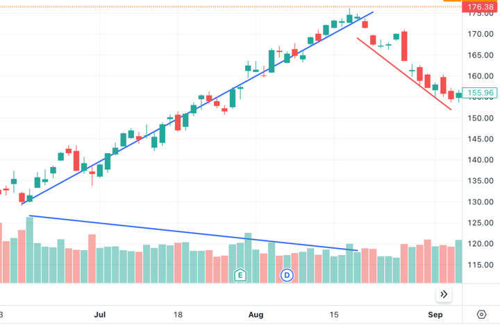
Trendlines - connect highs or lows to show trends
Trendlines are straight lines that connect either a series of rising highs or falling lows on the chart. Trendlines illustrate the prevailing direction of price action.
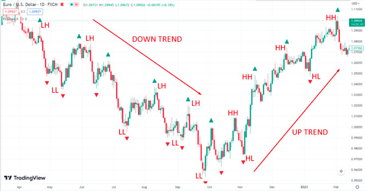
Uptrends show a series of higher highs and higher lows. The uptrend line connects at least 2 or more of the lower highs. As long as prices remain above the trendline, the uptrend remains intact.
Downtrends have lower highs and lower lows. The downtrend line connects at least 2 of the higher lows. If prices remain below the downtrend line, the downtrend is still in effect.
Rising trendlines act as support - they tend to stop declines and propel prices higher from the trendline. Conversely, falling trendlines act as resistance - they tend to stop rallies and push prices lower from the trendline.
Trendlines help traders identify the overall trend, define the risk of a trade, identify potential support/resistance levels, and signal when a trend may be reversing. Significant breaks above or below the trendline warn that the previous trend may be coming to an end.
Traders look to buy on pullbacks to an uptrend line or sell on bounces to a downtrend line. Trendlines become more significant the more times the price touches the line. They help separate the overall trend from routine pullbacks along the way.
Examples of using trendlines on stock charts:
- Connecting a series of higher lows to form an upward-sloping trendline - prices bouncing off this line indicate an upward trend. Traders can buy pullbacks to the trendline.
- Drawing a downward sloping trendline by connecting lower highs - The stock hitting resistance at this downtrend line and reversing lower signals a downtrend. Traders can sell into rallies to the trendline.
- A break above an uptrend line followed by a pullback that holds above the old trendline - This validates the breakout and suggests a new uptrend. Traders will try to buy the pullback.
- Prices close below a long term downtrend line - A break of support indicates that the previous downtrend has ended. Traders will look for further closes below the trendline to confirm a trend reversal.
- Drawing parallel trendlines with price - These rising channel lines define the rhythm of pullbacks and rallies in an existing trend. Traders buy near the lower line and sell near the upper line.
- Extending trendlines into the future as targets - The further the extended line is from the price, the weaker it becomes as a potential target. However, it still gives traders a measured price projection.
- Draw internal trendlines to connect swing highs/lows - These lines identify shorter-term trends that exist within the larger trend. Breaks above/below them signal potential reversals ahead of the primary trend line.
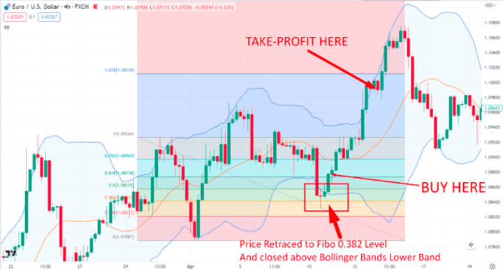
Support and resistance - floor and ceiling areas on chart
Support is a price level at which a stock has repeatedly found buying interest. When the price falls to this area, buyers step in to absorb the selling pressure and stabilize the decline. This buying interest prevents the price from falling further.
Resistance is a price area where a stock has repeatedly encountered selling pressure. As the price rises to this area, there is increased selling that prevents the price from rising higher. The selling pressure absorbs buying interest at this level.
Former support levels often become resistance on the rebound. And former resistance levels often become support on subsequent pullbacks.
Support and resistance form when the psychology of a market aligns with a particular price zone. Traders expect either buying or selling to occur in these areas because it has happened in the past. This collective belief becomes a self-fulfilling prophecy.
Floor traders look closely at support/resistance levels to time their entries and exits. They look to buy at or near support with a stop below the support. And they look to sell at or near resistance with a stop above resistance.
Significant support/resistance levels become more important when they are tested multiple times. The more times a level holds and the price rebounds from it, the stronger that support/resistance becomes.
A break below major support signals the potential for further downside. And breaking through strong resistance opens up upside potential for new highs. Support and resistance are guideposts for measuring the direction and strength of a trend.
Examples of how support and resistance levels work on stock charts
- Prices falling toward a previous swing low or trough - This support level has halted declines twice before, so buyers may emerge if it's tested a third time.
- A stock hitting resistance as it approaches previous highs around $50 - The stock has struggled to clear $50 several times over the past year, making this a significant overhead resistance zone.
- Major support forming around $20 on a stock that has bounced many times as the price drops into this area - $20 represents a key psychological level and the bottom of the previous trading range, indicating strong support below.
- Prices rejected near the 200-day moving average on multiple rallies - The 200-day often acts as resistance or support, so this average attracts a lot of technical traders watching this level.
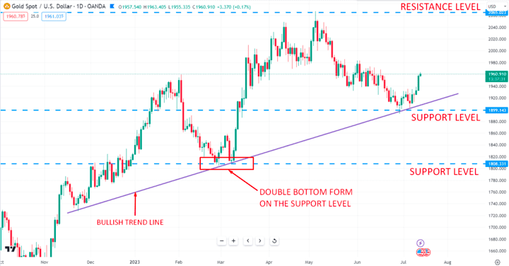
- Gold bouncing off $1,800 several times in a matter of months - $1,800 is showing increasing strength as support, given how reliably buyers defend this price zone on dips.
- A technology stock hitting resistance near all-time highs - Previous highs often act as resistance as bulls take profits and bears defend that level. It takes heavy volume for prices to break through.
- Prices holding above the previous breakout point during a pullback - Old resistance becomes new support, so staying above the breakout area helps validate the initial upside breakout.
Gaps - spaces between high and low of two days
Gaps occur when the opening price of a stock (or any asset) is significantly higher or lower than the previous day's closing price. This leaves an empty space or "gap" on the price chart between the high and low of the two trading sessions.
There are several types of gaps:
- Common Gaps - A small gap caused by normal daily price fluctuations and lack of significant overnight trading activity. These routine gaps usually close within a few days.
- Breakaway Gaps - Gaps that mark the beginning of a major price trend supported by heavy volume. They form at the beginning of significant rallies or collapses. They tend not to fill quickly.
- Runaway Gaps - Gaps that occur within an existing trend, reflecting an accelerated movement. Taken as evidence that the trend is gaining strength. These gaps may not be filled for a long time.
- Exhaustion Gaps - Gaps near the end of a sustained move, signaling that the trend is exhausting itself. The last burst of enthusiasm before a reversal. Have a high probability of being filled.
Traders watch gaps closely for timing entries. Breakaway and runaway gaps are traded in the direction of the new trend. Exhaustion gaps are traded in anticipation of a reversal. Common gaps attract short-term traders who want to play the fill.
Gaps provide valuable information about changes in supply and demand. An upside gap indicates eager buyers and an increase in demand. A gap down signals a glut of sellers and a wave of supply hitting the market. Volume increases on gap days as conviction builds.
Examples of different types of gaps on stock charts:
- A breakaway gap on heavy volume as a stock spikes higher after reporting exceptional earnings - This signals the start of an uptrend as buyers step in aggressively.
- A gap below major support after the company warns of lower guidance - The breakaway gap to the downside initiates a downtrend with minimal trading in the gap area.
- A gap up mid-trend as positive industry news sparks renewed buying interest - This breakaway gap shows the previous uptrend accelerating with conviction.
- A failed product launch or clinical trial results in a down gap through the 200-day average - Increased selling pressure causes this exhaustion gap, signaling a potential trend reversal.
- On a Friday, prices gap above resistance levels after an upgrade from a major investment bank - With two days to go before trading resumes, this breakout gap holds open and attracts further buying on Monday.
- Prices break below previous swing low support after the CEO unexpectedly resigns - Panic selling creates this gap, which is likely to lead to further declines.
- Earnings gaps that fade a day or two later as the stock gives back most of the initial move - This shows a common gap created by a one-day reaction rather than any lasting conviction behind the move.
Chart Analysis Techniques
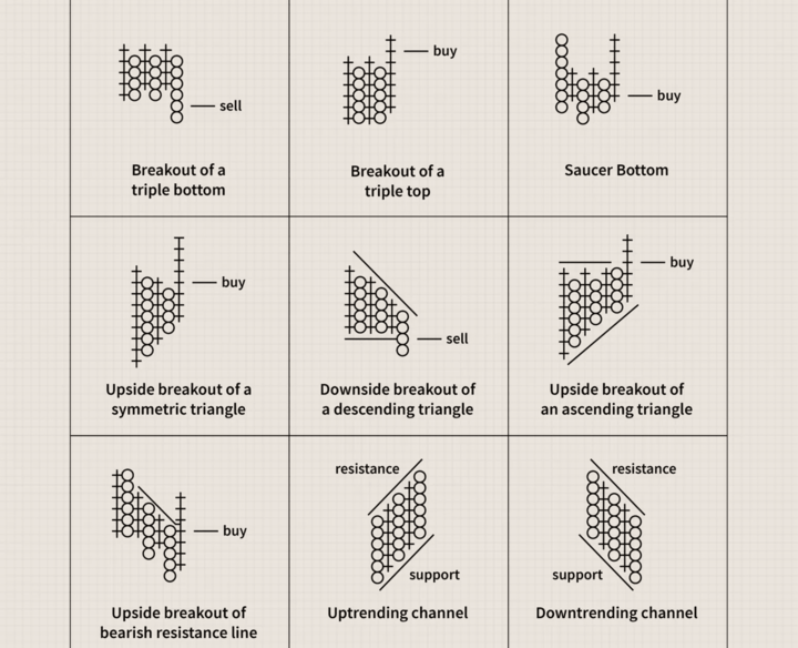
Identifying patterns - head and shoulders, channels, triangles
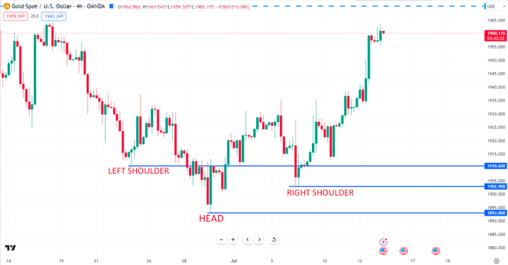
Head and Shoulders pattern:
- Formed during an uptrend and signals a potential trend reversal. Consists of left shoulder, head, right shoulder.
- Neckline connects lows before and after head. A break below the neckline signals a change in trend.
Channels:
- Parallel trend lines that contain price action. Upper and lower channel lines act as resistance and support.
- Price oscillates between the channel lines in the direction of the trend until a breakout occurs.
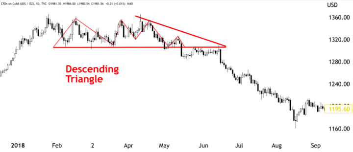
Triangles:
- Represent a period of consolidation before a breakout. Formed by trendlines connecting a series of peaks and troughs.
- A breakout is triggered when the price breaks through the triangle's support or resistance trendlines.
- Variations include ascending, descending and symmetrical triangles.
Cup and Handle:
- Bullish continuation pattern characterized by a pullback and consolidation after an advance. Forms a "cup" shape followed by a resumption of the uptrend.
- The advance after the cup forms the handle and signals a breakout on high volume.
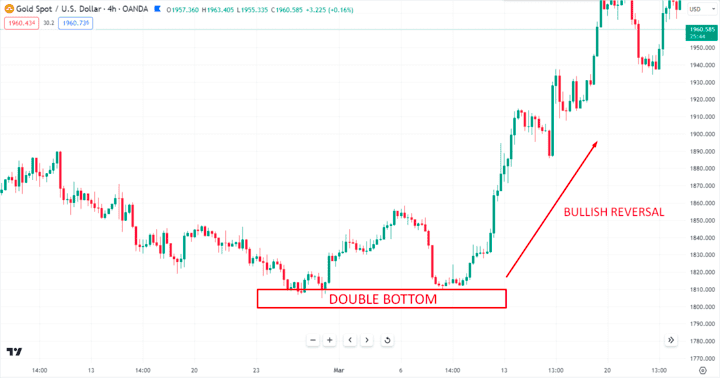
Double tops and bottoms:
- Bullish/bearish reversal patterns formed after a sustained trend. Involves two swing highs or swing lows around the same price level.
- The neckline connecting the highs/lows is broken on high volume to confirm the reversal.
Technical analysts try to identify and trade patterns as early as possible, entering on confirmation of a valid breakout or breakdown. Common patterns signal both continuations and reversals in the existing trend.
Indicators - moving averages, RSI, MACD, Bollinger Bands
Moving Averages - Calculate the average price over a period of time. Commonly used are 50-, 100- and 200-day moving averages. Crossovers signal trend changes.
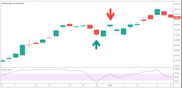
Relative Strength Index (RSI) - Measures the speed and change of price movements on a scale of 0 to 100. Readings above 70 indicate overbought conditions, while readings below 30 indicate oversold conditions. Divergences can herald reversals.
MACD (Moving Average Convergence/Divergence) - Plots the difference between short- and long-term moving averages to identify shifts in momentum and trend strength. The intersection of the MACD line with the signal line indicates trend changes.
Bollinger Bands - Plots the price surrounded by upper and lower bands set at 2 standard deviations from a simple moving average. Bands expand during volatility and contract during consolidation. Tests of the bands signal reversals.
Stochastic Oscillator - Uses a scale of 0 to 100 to reflect whether closing prices are nearing oversold or overbought levels. Readings above 80 indicate overbought conditions, while readings below 20 indicate oversold conditions. Crossovers can predict trend changes.
On-Balance Volume (OBV) - Tracks the cumulative flow of volume into and out of a security. Uptrends show rising OBV, while downtrends have falling OBV. Divergences between OBV and price can foreshadow reversals.
Traders use indicators to confirm price movements, spot divergences, identify support/resistance levels, and time entries and exits. Multiple indicators can be combined to enhance analysis and signals.
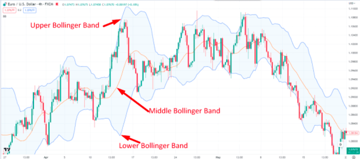
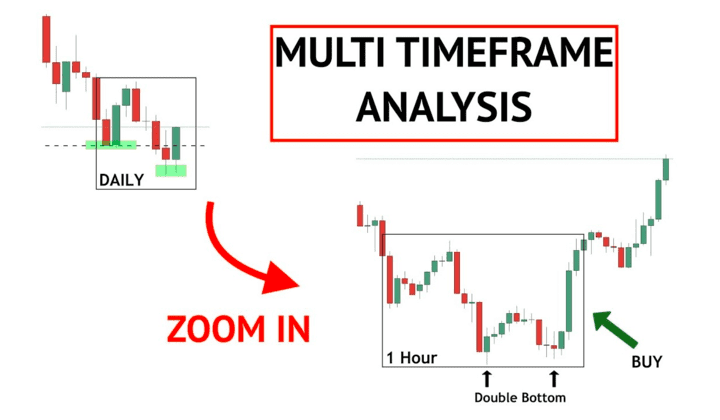
Chart types by timeframe - long vs short term charts
Long-term charts (monthly, weekly, daily intervals)
- Used to identify overall trends, key support/resistance levels and trading ranges
- Moving averages are slower to react on long timeframes, with more emphasis on major moving averages such as the 200-day.
- Indicators such as MACD and RSI are slower to signal overbought/oversold readings and divergences.
- Major fundamental developments and technical breakouts/breakdowns are more meaningful
- Ideal for long-term investors who want to gain exposure to major trends
Short-term charts (60 min, 30 min, 5 min intervals)
- Reveal more detailed price action, momentum shifts and trading opportunities
- Faster moving averages such as 10-day or 20-day are used for dynamic trend analysis
- Oscillators such as stochastics are more useful for timing entry and exit points
- Intraday chart patterns, support/resistance become more important
- Well suited for active traders looking to capitalize on volatility and short-term inefficiencies
In summary, long-term charts define the primary trend and major reversals, while short-term charts provide helpful tools for actively trading around the core trend. Many traders use both long-term and short-term charts in tandem for a complete market perspective.
Making Trading Decisions with Charts
Confirming indicators - don't rely on one signal
It is generally better to confirm signals using a combination of indicators and techniques:
- Don't buy just because the RSI dips below 30. Also look for a positive divergence on the MACD.
- Don't go short just because the stock has bounced off a resistance level. Wait for a bearish moving average to cross.
- Don't assume that a breakout will follow. Confirm the breakout with increasing volume.
- Don't expect a reversal when the MACD crosses. Check if the OBV is also converging or diverging from the price.
- Don't expect support to hold without checking the Stochastic Oscillator. Overbought conditions can fuel a breakdown.
- Don't interpret a double top as a permanent top. See if the stock makes a higher low on the subsequent pullback.
Basically, the more confirming indicators that align with a buy or sell signal, the more likely it is to result in a winning trade. Using price patterns, momentum oscillators, volume and moving averages together paints a more complete technical picture and improves decision-making. No single indicator is perfect, but combining multiple indicators reduces the likelihood of false signals.
Watching volume for conviction - higher on breakouts
Volume provides crucial confirmation of the conviction and sustainability behind price breakouts to new highs or lows.
Here are some key ways traders use volume:
- Increasing volume on bullish breakouts indicates broad participation in the rally. This lends credibility to the breakout.
- Decreasing volume on a breakout indicates a lack of commitment on the part of the bulls. This casts doubt on the validity of the move.
- Surging volume on downside breaks indicates panic selling conditions that can accelerate the decline.
- Light volume on breakdowns may mean that the bears lack control and the previous trend may resume.
- Sustained high volume during a trend underscores its strength and directional conviction.
- Decreasing volume during pullbacks in an uptrend is less worrisome than decreasing volume during rallies.
By analyzing volume patterns, traders gain valuable perspective on emerging trends, reversals, shakeouts, and potential exhaustion moves. Volume provides an X-ray into the psychology driving short-term price action.
Drawing trendlines and channels - estimating projections
Drawing trendlines and channels on price charts is an extremely useful technique for estimating potential future price projections and planning trades. Here are some key tips:
- Connect swing highs and lows to draw ascending, descending or horizontal trendlines that represent the prevailing trend.
- Channels are two parallel trendlines that contain the price action. The upper and lower channel lines often act as resistance and support.
- Channels surrounding an uptrend provide estimates of where pullbacks may find support and project extensions higher.
- Channels on downtrends indicate likely areas where bounces may find resistance and declines may find support.
- The more times the price touches and respects the trendline boundaries, the more significant the channel becomes.
- Traders can estimate price targets by measuring the height of the channel and projecting that distance from the trendline breakout point.
- The convergence or divergence of a volume indicator such as the On Balance Volume relative to the trend channel provides clues to impending breakouts.
- Trendline breaks signal potential acceleration in the direction of the break, while drops to the lower channel line represent buying opportunities.
Drawing channels based on trendline analysis gives traders an invaluable visual perspective on the expected direction and key levels for managing trend trades. Channels are one of the most helpful charting techniques for planning entries and exits.
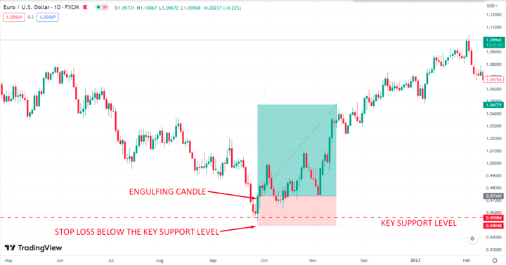
Using risk management - stop losses, position sizing
Proper risk management through stop losses and position sizing is critical for traders using technical analysis. Here are some important tips:
- Use stop losses to limit the potential loss per trade to 2-3% of your account value. Close trades quickly if the price moves against you.
- Set stop orders below key support levels for long trades and above resistance levels for short trades. Move stops when the trade becomes profitable.
- In uptrends, place trail stops below the rising bottoms of pullbacks. In downtrends, place trail stops above descending rally tops.
- Size positions according to your stop distance. Use smaller positions for wider stops and larger sizes for tighter stops.
- Risk only 1-2% of your equity per trade. This will prevent overexposure and allow you to withstand a series of losing trades.
- Increase position size incrementally as your account value increases. Higher capital allows for greater size while maintaining the same 2% risk level.
- Use volatility-based position sizing models that take into account a stock's average daily range of movement.
- Diversify across multiple uncorrelated trades rather than concentrating capital in a few positions.
By following prudent risk management rules, technical traders can survive inevitable losses and avoid account damaging drawdowns. Discipline is required to adhere to stop losses and position sizing best practices.
Common Charting Mistakes
Overtrading - ignoring plan and overreacting to noise
Overtrading refers to excessive buying and selling of positions without adhering to a trading plan. It often results from an emotional overreaction to market noise, news events, or fear of missing out. Overtrading tends to be destructive for several important reasons:
First, overtrading results in higher transaction costs due to increased commissions and bid-ask spread expenses. These costs directly reduce returns.
Second, overtrading leads to suboptimal trade placement and poor entry and exit. Overreaction often results in selling winners too early, exiting profitable positions before targets are reached, or chasing momentum too late after the move has occurred.
Third, overtrading diverts attention from high probability technical setups to market noise. The distraction from the trading plan reduces the clarity and conviction for entering and maintaining positions.
Finally, overtrading can quickly make winning short-term systems unsuccessful by interfering with the overall strategy. Taking too many marginal trades outside of the plan degrades performance.
Successful technical traders have patience and discipline. They follow the trading plan while waiting for high probability signals rather than overreacting impulsively. Controlling overtrading through risk management and maintaining accountability in the trading journal are essential to performance.
No confirmation - acting on one indicator or pattern
Basing trades on a single indicator or pattern often leads to poor timing and failed setups. Technical analysts stress the importance of confirmation when identifying trades. For example, overbought/oversold oscillators such as the RSI work best when paired with reversals in price action rather than on their own. Moving average crossovers should be confirmed with a break above resistance or higher swing highs. Even reliable chart patterns benefit from additional confirmation - a wedge breakout is stronger when coupled with increasing volume. No indicator is perfect or will work every time. The savvy technician trades with an edge by waiting for the convergence of multiple indicators and trade signals, rather than acting impulsively on just one. Seeking confirmation across multiple measures and timeframes, such as short-term oscillators, moving averages, and pattern breaks, greatly improves accuracy. Patience for confirmation aligns trades with the highest probability opportunities. Trading without it often leads to mistimed entries, early exits, and failed setups.
No risk management - entering without stop loss
Entering trades without a predetermined stop loss is one of the biggest mistakes that technicians make. Without a stop, you expose your capital to unlimited risk should the trade go against you. Stop losses limit and define the maximum loss one is willing to accept on a trade. Traders without stops face margin calls or forced liquidations in the event of extreme moves against their positions. Even with stops in place, gaps can trigger slippage on the exit. Without stops, the risks are magnified. In addition, trading without a plan to limit losses leads to emotional decision making when a trade declines in value. It clouds objectivity. Stops enforce discipline and prevent traders from staying in losing positions, hoping for a reversal that may never occur. They allow traders to reevaluate and enter new trades with clarity, rather than suffering the duality of hoping a losing trade will recover. Using appropriate stop losses on all trades based on technical levels is essential for risk management and long-term trading success.
Subjectivity - seeing patterns that aren't there
The subjective nature of pattern identification creates a tendency for traders to see false signals that match their biases. Imaginary or wishful thinking patterns are dangerous and costly. Traders may see familiar or expected formations such as head and shoulders where none exist, or squeeze interpretations out of random noise. Such subjectivity leads to low-probability trades. False patterns also psychologically trap traders in bad positions as they wait in vain for predicted moves that never materialize. Skilled technicians apply analysis in an objective, disciplined manner according to defined rules. They only act on high probability patterns with multiple characteristics that are aligned, verified by indicators, and require confirmation. Traders are best served by acknowledging the subjectivity inherent in pattern analysis. They should adopt a mindset of objective observation rather than projecting wishful outcomes. It is crucial to let the market confirm the validity of patterns by breaking key levels or volumes before acting. False patterns disappear upon retesting, while valid signals persist over multiple time frames.
Key Takeaways on Using Charts
- Identifying Trend Direction - Determining whether the prevailing trend is up, down, or sideways is critical. Traders look at the slope of key moving averages on long-term charts to determine the trend.
- Confirming signals with indicators - Oscillators such as RSI, MACD and Stochastics help to verify overbought/oversold conditions and divergences to improve the timing of entries and exits.
- Spot Breakouts and Breakdowns - Price breaking out of a pattern, past key support/resistance or a trendline signals a potential change in trend. Volume helps confirm the validity of the break.
- Setting Risk Parameters - Major recent swing highs and lows establish initial stop levels. Technical levels also highlight areas to take profits if the trade moves favorably.
- Time Entries - Traders often buy pullbacks in uptrends, favoring value areas such as the 20-day moving average. In downtrends, rallies to a resistance level provide shorting opportunities.
- Managing the Trade - Monitor price action and indicator dynamics, such as the MACD crossing its signal line. If a level is retested, it may act as new support or resistance.
- Plan the exit - Indicators that signal overbought or oversold conditions indicate exhaustion before a reversal. Exit partial positions into strength.
- Review charts objectively - avoid emotional bias
When analyzing charts, emotional biases such as fear, greed and hope distort analysis and lead to false trading signals. Skilled technicians review charts objectively by adhering to defined criteria and not forcing trades. Steps to improve objectivity include top-down analysis starting from higher timeframes, identifying key levels and indicators first before spotting setups, and requiring confirmation before entering. Reviewing charts generated by the market in real-time or charting missed days live also increases objectivity. Removing emotion is key to accurate charting.